Byron Anson
might be at the gym, hooping ⛹️
is teaching design 👨🏿💻
is most likely making pasta 🍝
is styling an outfit 👔
is exploring the world 🌏 🛫
Byron Anson
might be at the gym, hooping ⛹️
is teaching design 👨🏿💻
is most likely making pasta 🍝
is styling an outfit 👔
is exploring the world 🌏 🛫
Byron Anson
might be at the gym, hooping ⛹️
is teaching design 👨🏿💻
is most likely making pasta 🍝
is styling an outfit 👔
is exploring the world 🌏 🛫
SoGoHa, a mobile gratitude app
Thoughtless, easy actions
SoGoHa on Android & iOS mobile
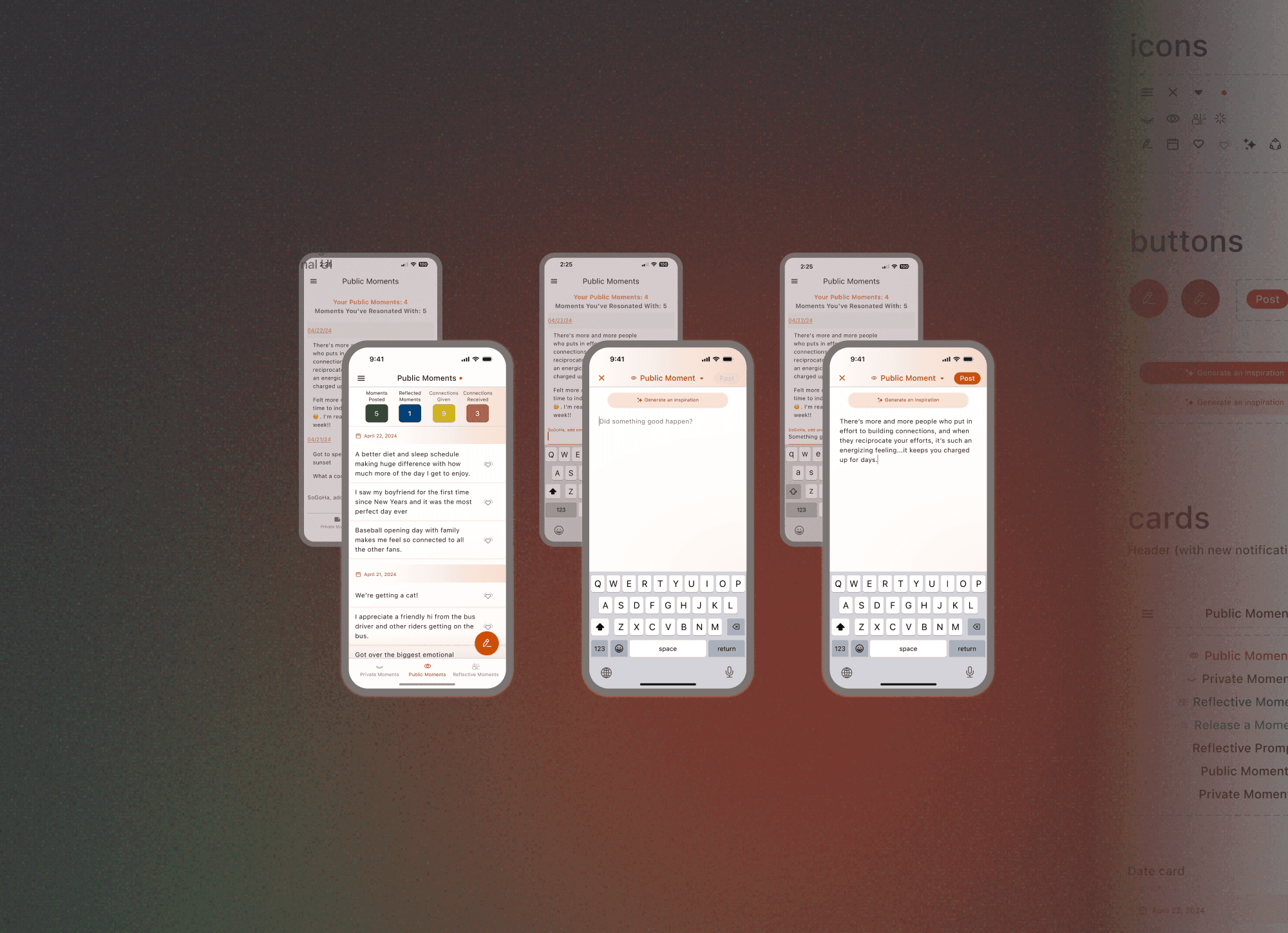
Designing an intuitive user-flow for posting messages on SoGoHa and revising the UI to enhance user engagement and reduce post creation time.
Role
—
Product designer
—
User researcher
Key Contributions
—
UX design
—
UI design
—
User research
—
Prototyping
Tools
—
Figma
—
Google forms
Final design
Insights from user studies highlighted usability problems related to posting on SoGoHa. The user interface and process were optimized to enhance usability and reduce the time it takes to post.
Additional features to address feedback related to posting content include options to generate example prompts, home/lock screen widgets, as well as the ability to post directly from an alert from SoGoHa.


Where we started
Something Good Happened
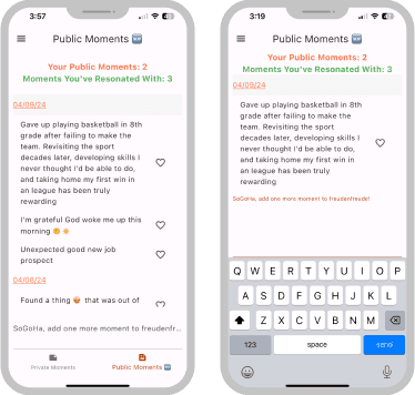
Where we started: SoGoHa 1.0
SoGoHa is a feed full of Something Good Happened, where users anonymously share and connect with each other over joyful moments.
The team had launched an MVP to both Google Android and Apple iOS app stores and had been happy to see a loyal user base with high consistency usage.
I was then brought on board as the team’s first designer to help continue the progress being made.
Research & Analysis
User research survey
Reaching out to the users
Now that the app had been in the market for a some time, I wanted to hear what users had to say. We designed a 10 question (anonymous, 5-15’ completion time, all questions optional) user-research survey to understand more from our users.
Now that the app had been in the market for a some time, I wanted to hear what users had to say. We designed a 10 question (anonymous, 5-15’ completion time, all questions optional) user-research survey to understand more from our users.
SoGoHa 1.0 Findings
We discovered a theme of users often finding it cumbersome to find and use SoGoHa’s primary call-to-action: posting a message. Before adding new features to the app, on top of this existing user-flow, we wanted to improve this primary feature.
We discovered a theme of users often finding it cumbersome to find and use SoGoHa’s primary call-to-action: posting a message. Before adding new features to the app, on top of this existing user-flow, we wanted to improve this primary feature.
Survey quote:
“But I did need to search to find the section for submitting a gratitude (it's on the bottom of the page and kind of blends in with everything around it)"
Competitive Analysis
How do others approach this pattern?
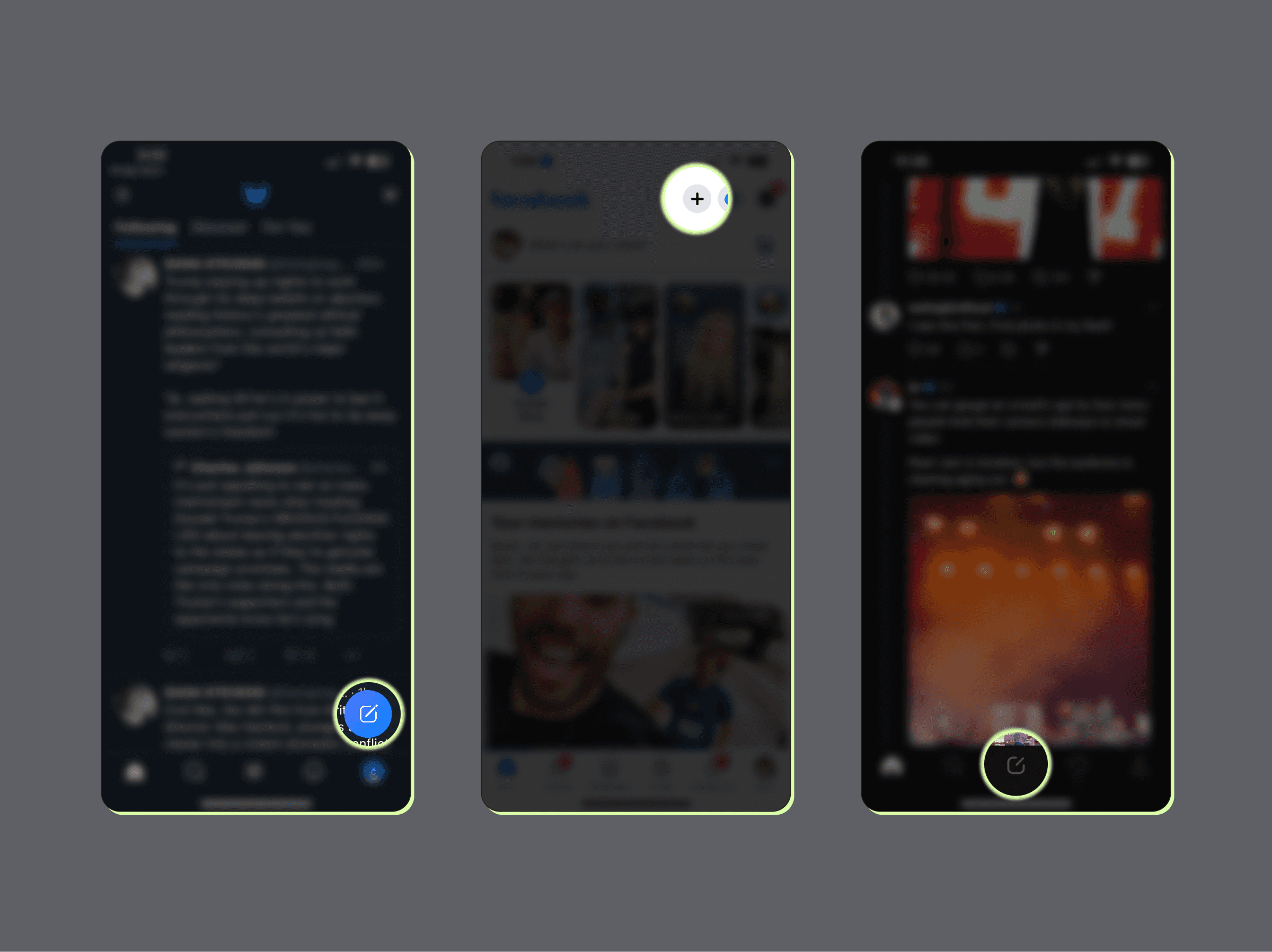


Competitor analysis revealed that platforms with streamlined, accessible posting interfaces see higher engagement rates. Additionally, studying direct & indirect competitors provided guidance to commonly used design patterns so that users would intuitively know how to use SoGoHa from the start.
Competitor analysis revealed that platforms with streamlined, accessible posting interfaces see higher engagement rates. Additionally, studying direct & indirect competitors provided guidance to commonly used design patterns so that users would intuitively know how to use SoGoHa from the start.
Our Opportunity
Users were struggling with the current message posting process, before adding new features to the app on top of this existing user-flow, our objective was to create a more intuitive & efficient way to post to SoGoHa.
Wireframes
Rapid ideation
Using design patterns from research as inspiration and the user journey as a guide, I sketch wireframes to help quickly get ideas out of (and into *as space clears up) my head.
Using design patterns from research as inspiration and the user journey as a guide, I sketch wireframes to help quickly get ideas out of (and into *as space clears up) my head.
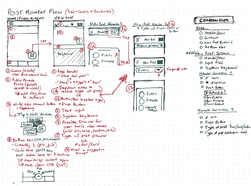


Key features included
A prominent post button, using depth to elevate its position and hierarchy
Removing the need to go to a specific screen to make a specific post by adding a screen that allows users to make any type of post they would like
Intuitive navigation cues to enhance usability and guide user to success
**Collaborating with development after wireframes were completed also ensured we were creating something within our technical constraints.
UI Design
Refining the Visuals
Using design patterns from research as inspiration and the user journey as a guide, I sketch wireframes to help quickly get ideas out of (and into *as space clears up) my head.
Using design patterns from research as inspiration and the user journey as a guide, I sketch wireframes to help quickly get ideas out of (and into *as space clears up) my head.
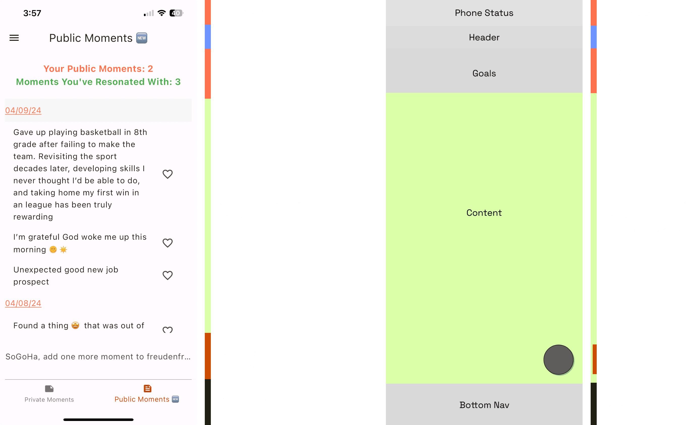


Hierarchy and scale
Using size, color, and layout to indicate the importance of content across pages, the revised public moments page page prioritizes the content, by using (a brand-colored) floating button, we used depth & color to set this as the 2nd most important item on the page.
Using size, color, and layout to indicate the importance of content across pages, the revised public moments page page prioritizes the content, by using (a brand-colored) floating button, we used depth & color to set this as the 2nd most important item on the page.


Proximity and whitespace
Using proximity to group elements together to allow users to be able to quickly scan and focus on their target content. Without changing any of the original font properties, we were able to reduce the real estate a single post would need.
Using proximity to group elements together to allow users to be able to quickly scan and focus on their target content. Without changing any of the original font properties, we were able to reduce the real estate a single post would need.


Balance and repetition
Defining each of the elements on the screen in a consistent matter with a focus on mobile sizing constraints to achieve balance and repetition.
Defining each of the elements on the screen in a consistent matter with a focus on mobile sizing constraints to achieve balance and repetition.
Wrapping it up
The final design has been handed over and is currently in build status.
Once launched, the team will be using metrics and user feedback to measure our success in the following ways:
User data analytics on posting (including time to post, time on screens, number of posts, cancels & task errors)
Watching user engagement overall
Continued testing and reaching out to our users
Recommendations from the team
Recommendations
Byron meets product design challenges with great communication skills to ensure we have alignment, then drafts designs drawing inspiration from thoughtful targeted research and user input.
During the design iteration process, it was minimal effort and he facilitated active two way dialog yielding in better designs. He draws out the design creator in me!
He delivers the final design components in organized and accessible ways using Figma amongst other remote work software effectively.
He is reachable and quick to help if certain components are having issues with code compatibility. I knew I had a good teammate when I experienced having a huge workload removed off of my plate and high quality work was getting done with speed.
I would love to keep our working relationship as long as possible!
— Laurie Wu, SoGoHa engineering
connect
Byron Anson
Available for product design and nocode* website development opportunities
* …but I have been known to inject some custom CSS & HTML 😉
connect
Byron Anson
Available for product design and nocode* website development opportunities
* …but I have been known to inject some custom CSS & HTML 😉
connect
Byron Anson
Available for product design and nocode* website development opportunities
* …but I have been known to inject some custom CSS & HTML 😉

