ServiceCourse
A mobile app for cyclists
Shaped by ongoing insights gleaned from the cycling community, ServiceCourse is designed to prevent bicycle breakdowns, offering users protection from:
— Expensive repair costs
— Becoming stranded
— Avoidable physical injuries
Role
Sole Designer & Researcher
Key Skills
— UX Design
— UI Design
— User Research
— Prototyping
Tools
— Figma
— Optimal Workshop
— InVision
Feature Highlights
Get a heads-up
Real-time insights into every bike component’s condition
Traditionally, bike maintenance relies on approximate time estimates, resulting in riders reactively dealing with issues and frequently overlooking regular part replacements.

Spot critical details quickly
Bike needs at a glance
Juggling multiple bikes for various needs significantly complicates upkeep, resulting in unreliable rides, a critical concern for commuters and performance enthusiasts.
Address issues with a tap
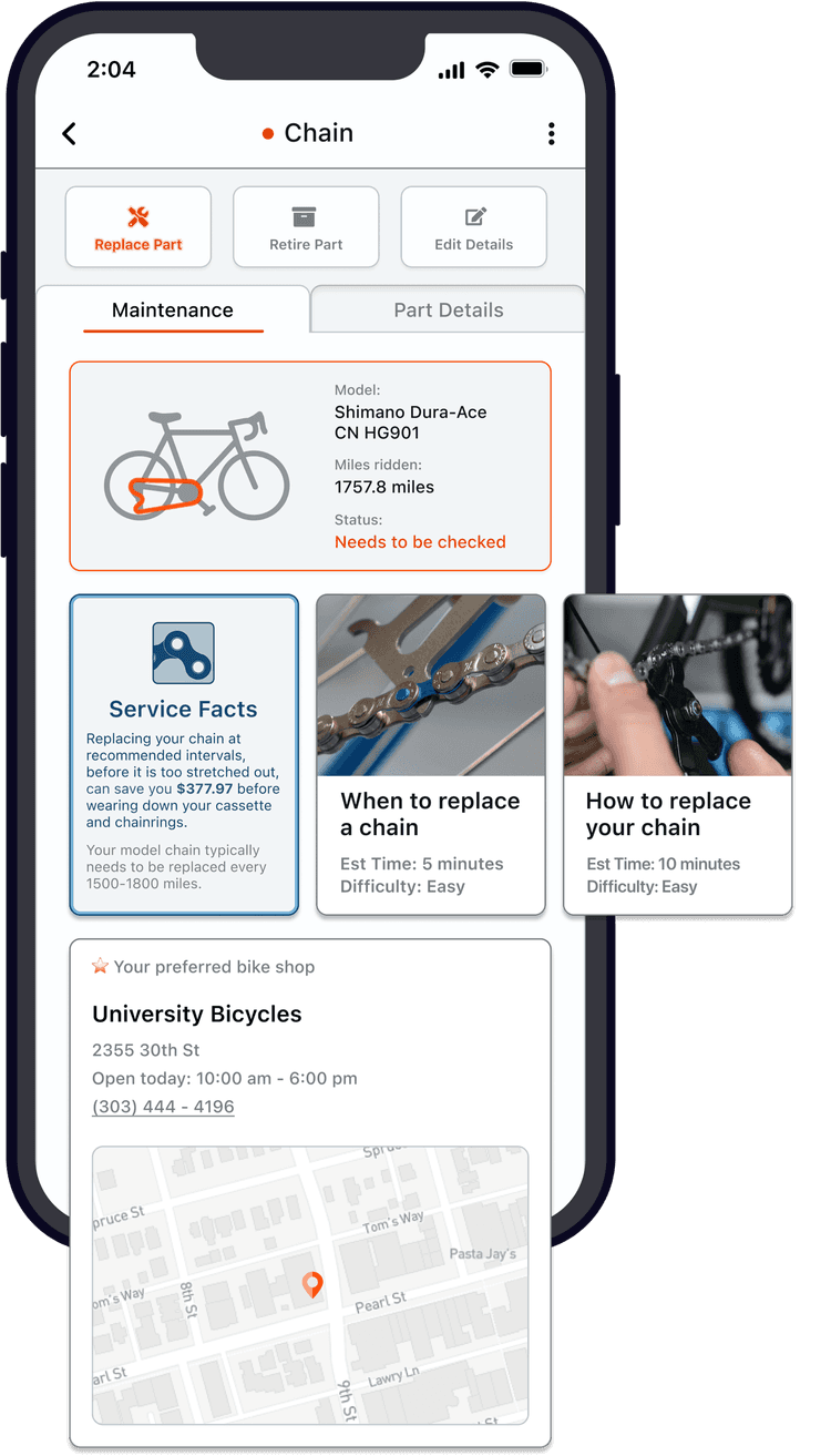
Proactive Mechanical support & guidance for all abilities
Detailed information accessible to all mechanical skill levels including:
Comprehensive component insights
Maximize bike performance & savings: unveil the benefits of every service
Step-by-step guides detailing the necessary tools and steps to address bike issues
Project overview
As a former competitive cyclist, I developed most of my network through San Francisco’s vibrant & diverse cycling communities. Throughout the days, I frequently would hear cyclists wish for better use of their ride data and I was curious to learn what more they actually needed.
Research, strategize, and design a product that leverages GPS ride data to solve existing needs for the cycling community.
Empathize
User research
Problem definition
Competitive analysis
Conceptualize
Feature prioritization
Persona / User Journey
Wireframe
Prototype / Usability
Design
Interaction Design
Design System
Uncovering user needs
Empathize
User research
To identify the common challenges that hinder the ride experience, I interviewed 14 cyclists across San Francisco’s cycling community.
What I discovered was an issue I heard repeatedly throughout these conversations:
Riders were experiencing break-downs of their equipment
Additionally I found that most cyclists did not have a reliable system for maintaining their bikes
93%
Stated they've faced mid-ride breakdowns that proper maintenance could've prevented
79%
Did not track maintenance, and those who did often relied on laborious, manual methods like tracking in spreadsheets
86%
Further complicating matters, most interviewees reported regularly using more than one bike.
Similar to the importance of maintaining a reliable car, this issue could result in the same range of issues:
Problems with getting to work
Problems with getting stranded
Further damage & costs associated with neglected parts
The potential for injury
“I picked up my bike from the shop after they replaced my chain, but they didn’t realize my cassette was worn...
On my next ride, I ended up crashing and breaking my bike. “
Synthesize
Problem definition
From the insights gleaned from the cycling community, I could see an opportunity worth exploring:
Secondary research
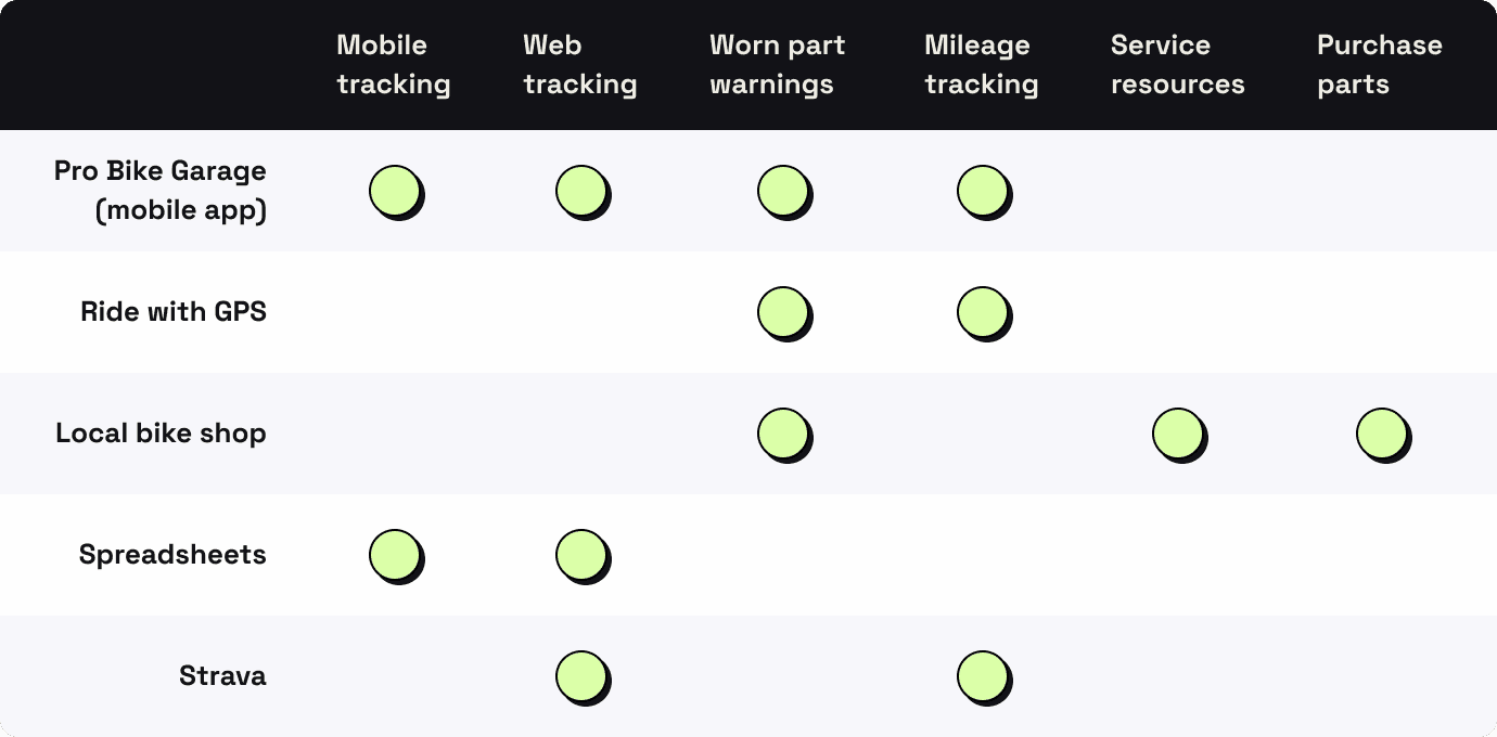
The competitive landscape
From here, I needed to explore if there were any existing solutions to this issue. After discovering some products that addressed this issue, I wanted to see how they functioned to determine their strengths and weaknesses.
Takeaways
There was a gap in the market for a comprehensive mobile solution, that could proactively act as a resource for addressing maintenance needs.
Existing options either:
Were not designed for this specific purpose
Offered a clunky experience that was difficult to navigate
Lacked helpful repair insights, posing a barrier for cyclists with limited mechanical expertise (which make up most of the population), leading me to prioritize designing for this as a product differentiator
UX Design
Conceptualize
Feature prioritization
Following a brainstorming session facilitated by tech's popular collaborative tool - sticky notes, this Expected Features vs. Impact matrix established:
The features an MVP needed (top left quadrant)
As well as some ideas to explore in order to differentiate this product (top left quadrant)
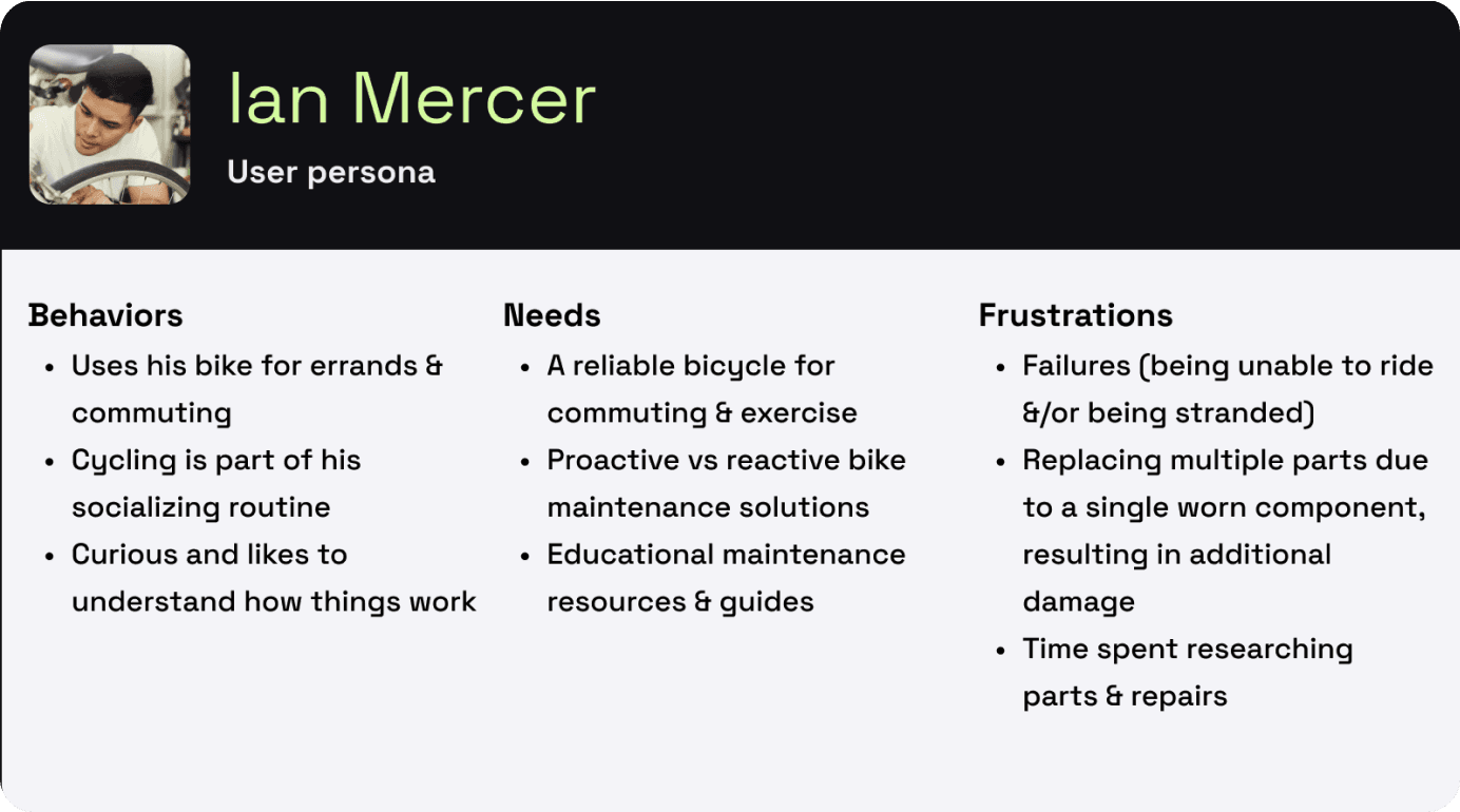
Persona
What Would Ian Do? Ian’s persona was created with the purpose of keeping decisions user-focused - especially when mapping out his user journey.
Ian gets an alert...now what?
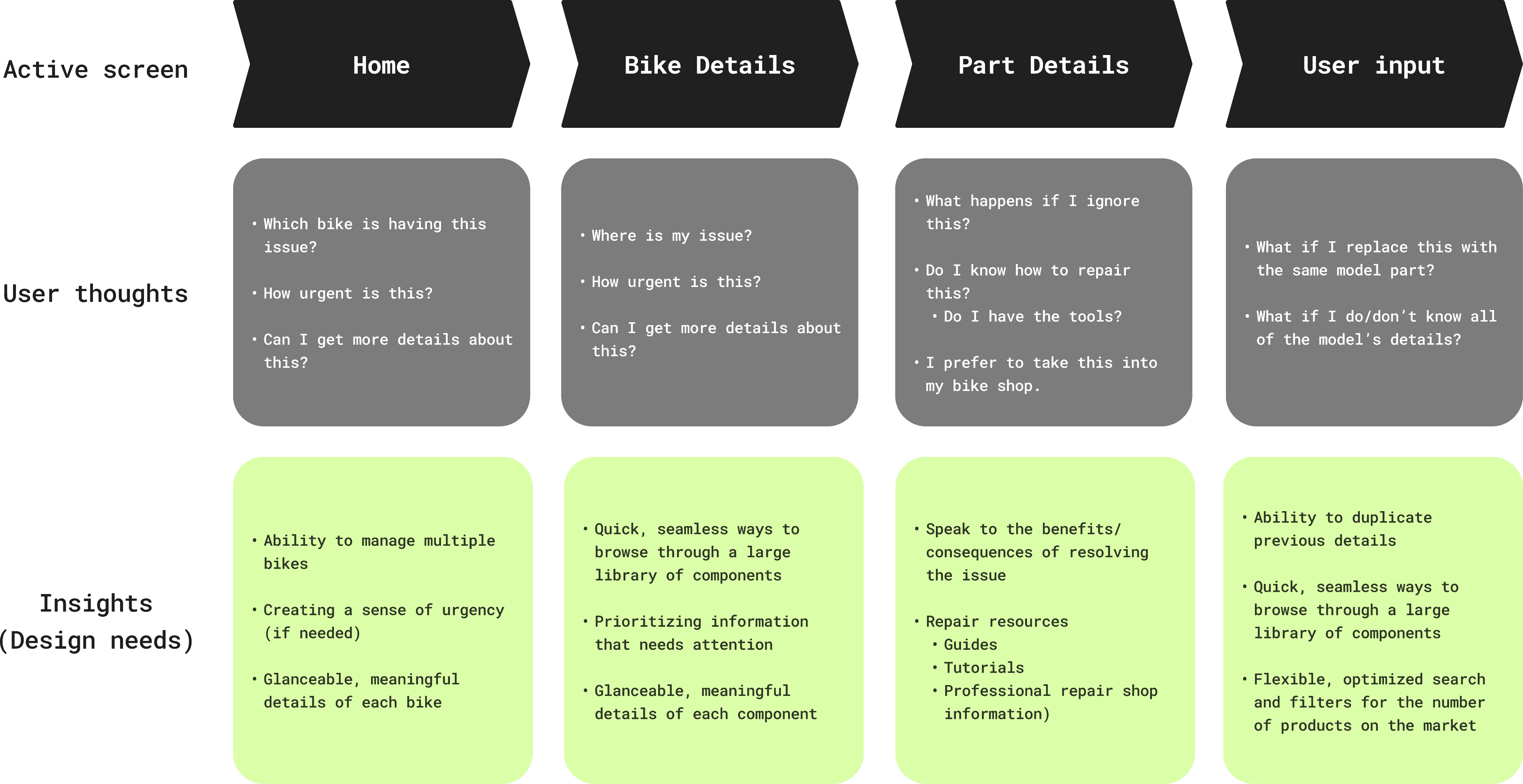
The user journey

*Ian taps the phone notification*
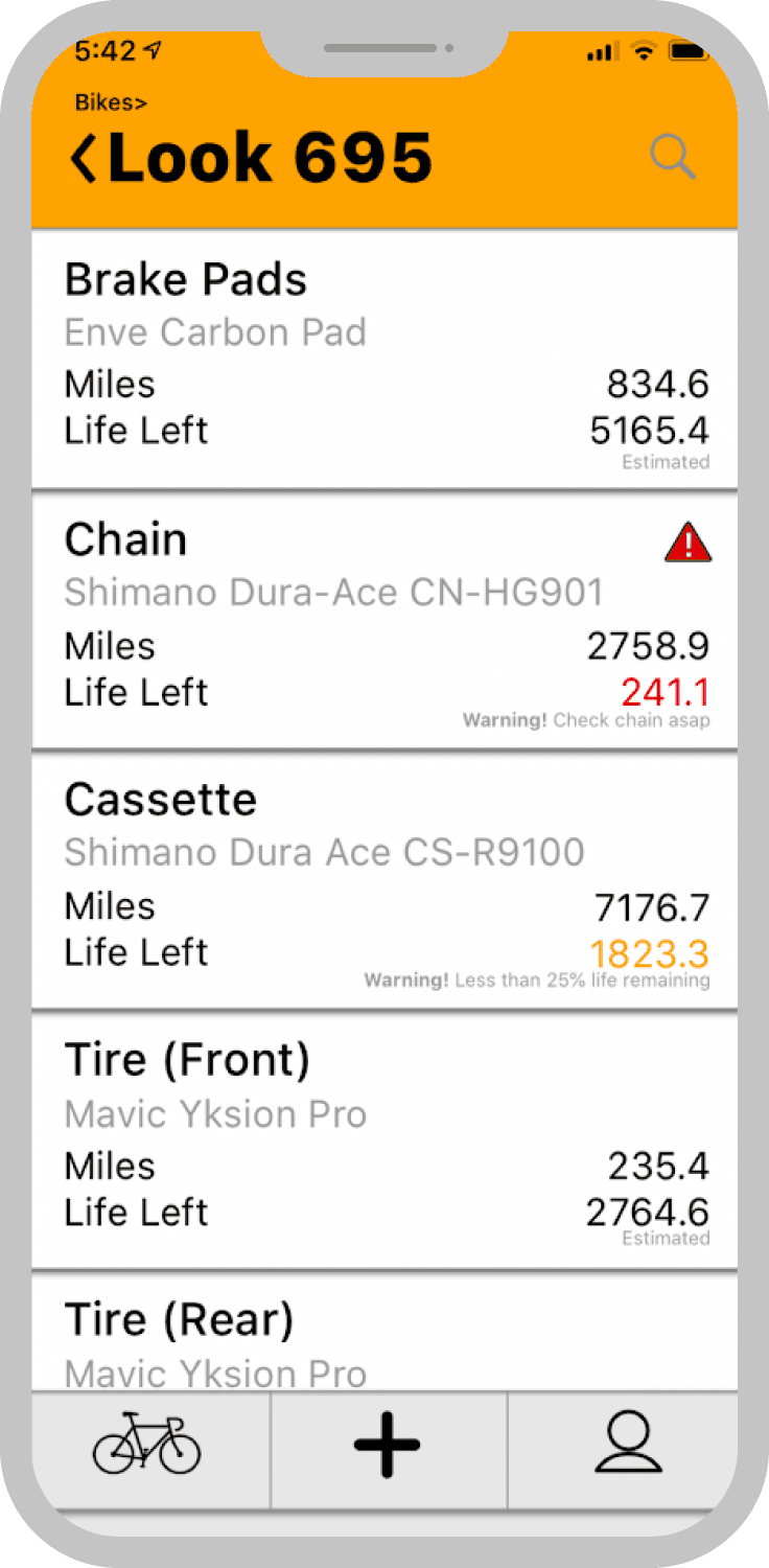
Mapping Ian’s thoughts & feelings across the user journey provided an outline of where helpful features could be proactively placed while identifying 3 key screens: home, bike details, and part details.
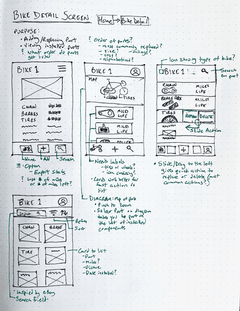
Wireframes
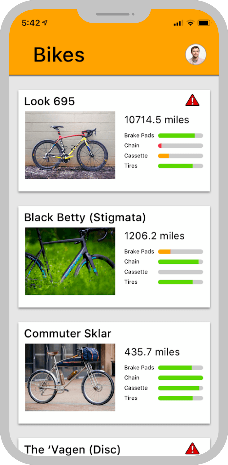
Creating wireframes with attention to a hierarchy of each screen’s purpose allowed me to ideate quickly while I experimented with different design patterns and layouts.
Prototyping & user testing
A clickable prototype was developed within a week to run usability testing. Users were asked to complete 2 scenarios crucial to the MVP and I wanted to observe:
Usability & the task-flow experience
Responses to the product differentiator: resources for maintenance
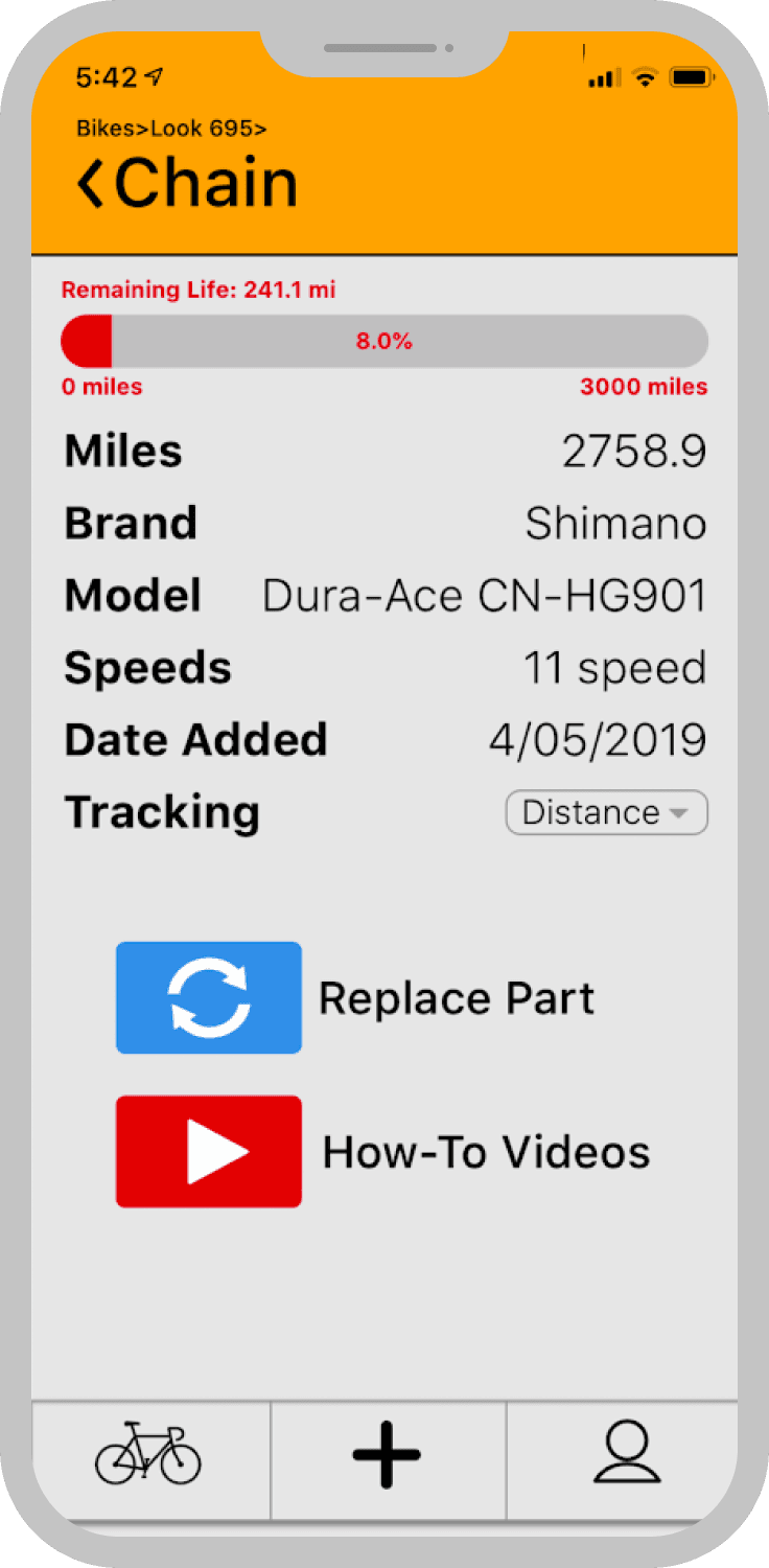
(🫣 My first swing mobile design)
Positive reception
Results confirmed that ServiceCourse was intuitive to use - all users were able to complete their scenarios without any intervention. Additionally, testing also revealed the delight of coming across the proactive resources placed in the app.
Opportunities
The prototype included a ‘health meter’ concept designed to show the amount of ‘life’ left on each component. I observed confusion about what this bar represented, leading me to explore alternative solutions that needed to be addressed.
UI Design
Design iterations
As a result of this project being my first design, I dove into understanding why everything felt... ‘off’. A visual design overhaul was done in order to polish the product and bring uniformity the app’s visual design language.
First to address was findings in user testing that revealed some confusion around the ‘health meter’ concept introduced in the prototype.
Getting users to take action
Turning a meter into a banner
The meter’s intention was to flag a potentially hazardous component to prompt a user to take action.
Revising this idea into a warning banner accomplished the attention-grabbing action.
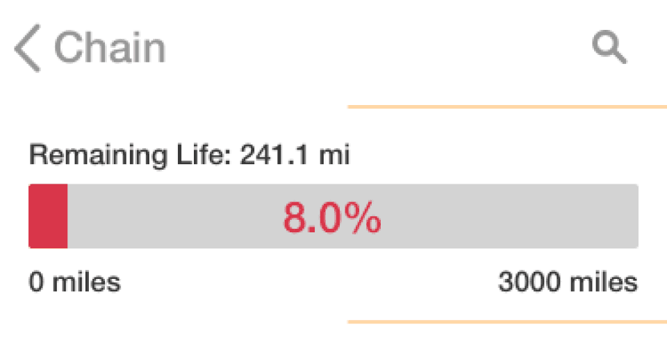
Original prototype

Final revision
Inspired by car dashboards
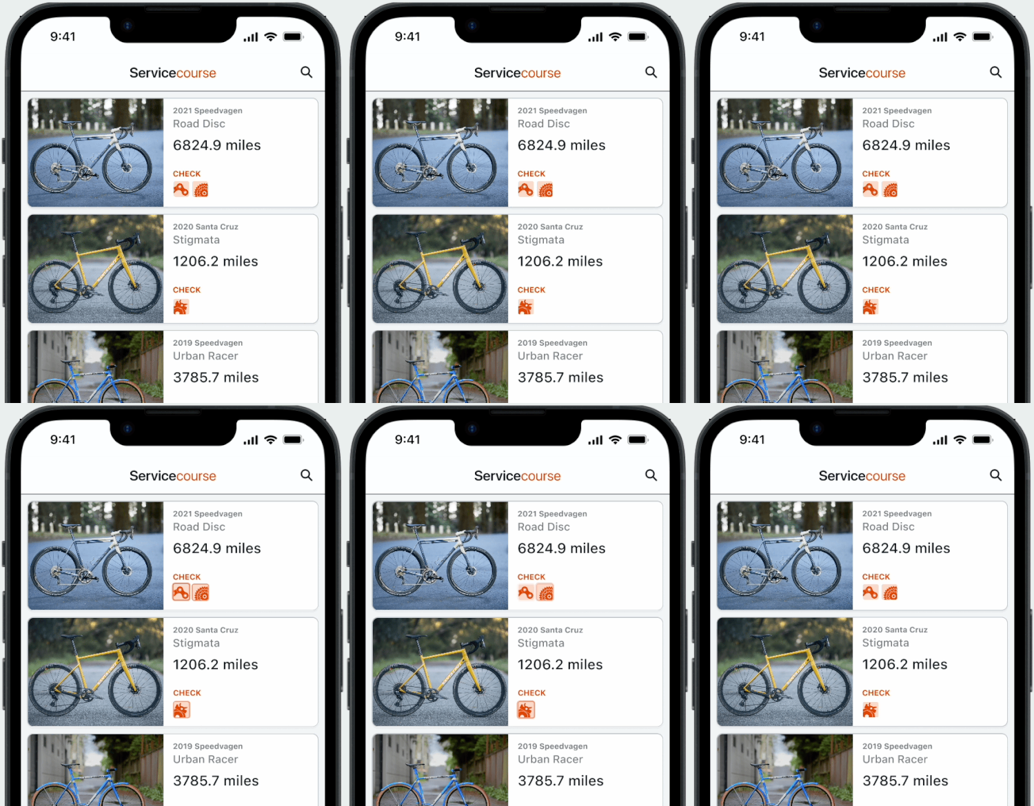
Evolution of the bike card
Given the variable nature of any component’s life, creating an accurate meter isn’t possible.
The intention of bringing awareness to key issues pivoted into a more recognized concept. Reminiscent of car warning lights, the redesign features distinct icons for each component, as well as improved spacing to enhance clarity.
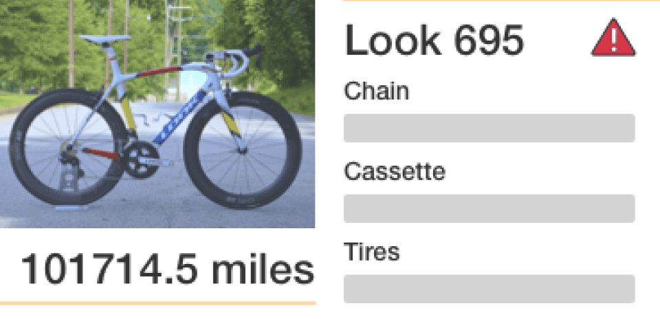
Original prototype
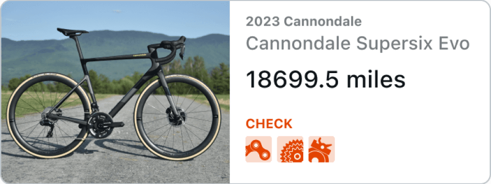
Final revision
Focused on even the smallest of details
Some other considerations
I continued to iterate the various assets across the system as the visual design language developed.
Removing hidden information from elements such as the input to the number of speeds a bike could have was iterated for usability.

Early design

Final revision
Additionally, the design pattern used on different toggles was altered to increase readability.

Early design

Final revision
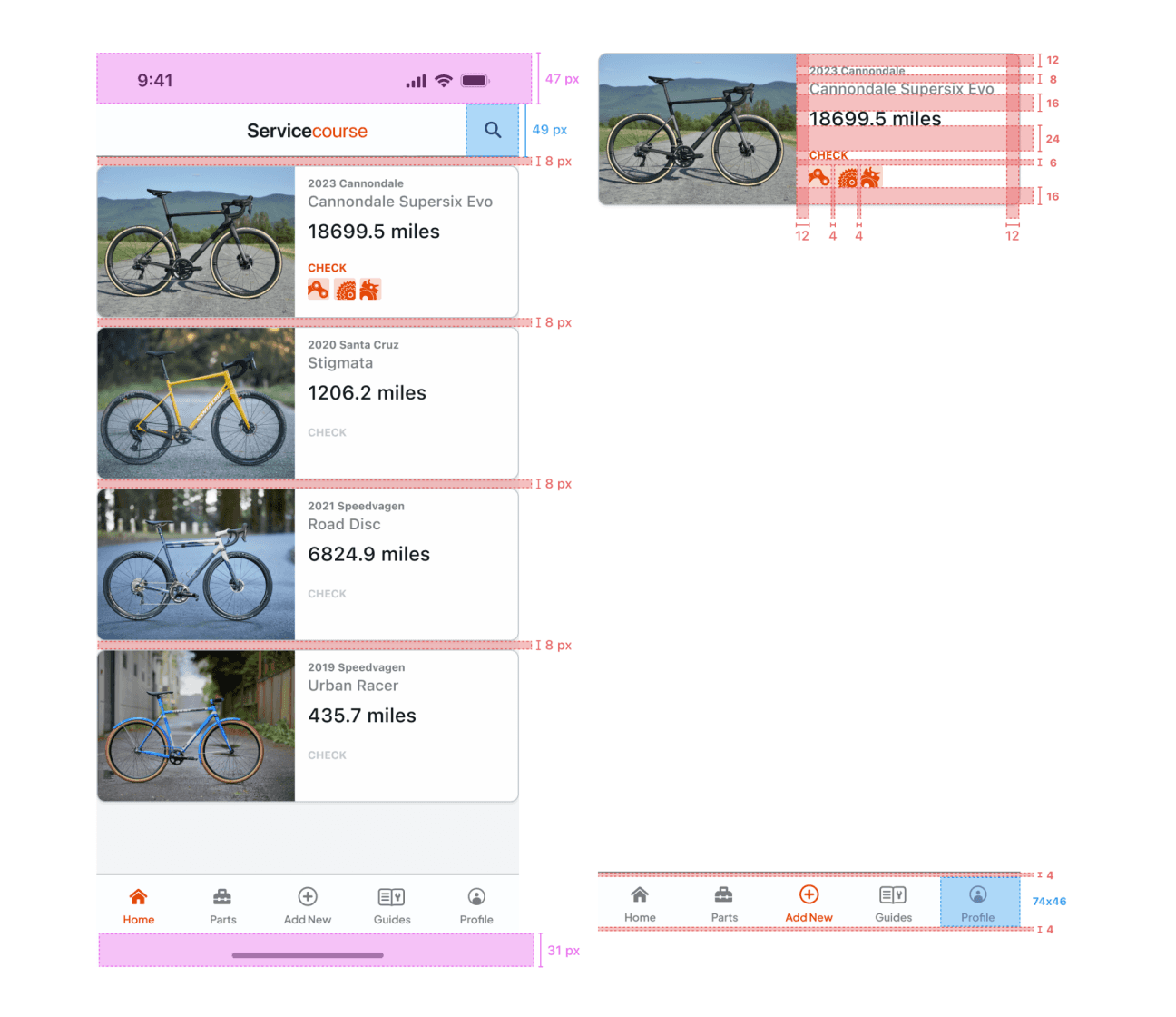
Design system
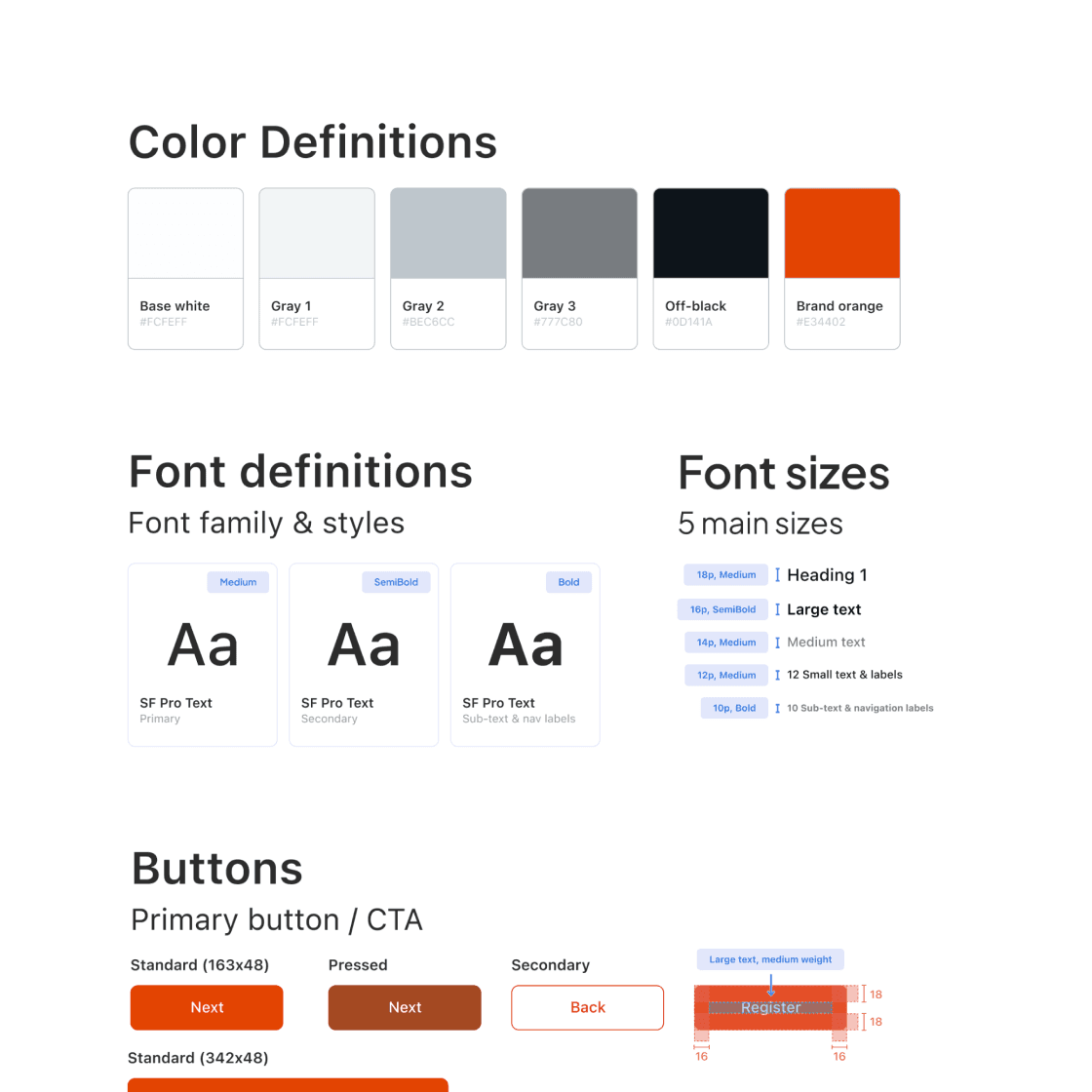
Fixing the initial prototype’s wonky design was solved through applying a design system. Defining the font, sizing, and spacing throughout was paramount to creating a uniform, visually pleasing design. Additionally, the palette was refined with accessibility in mind, ensuring contrast remained clear.
Closing
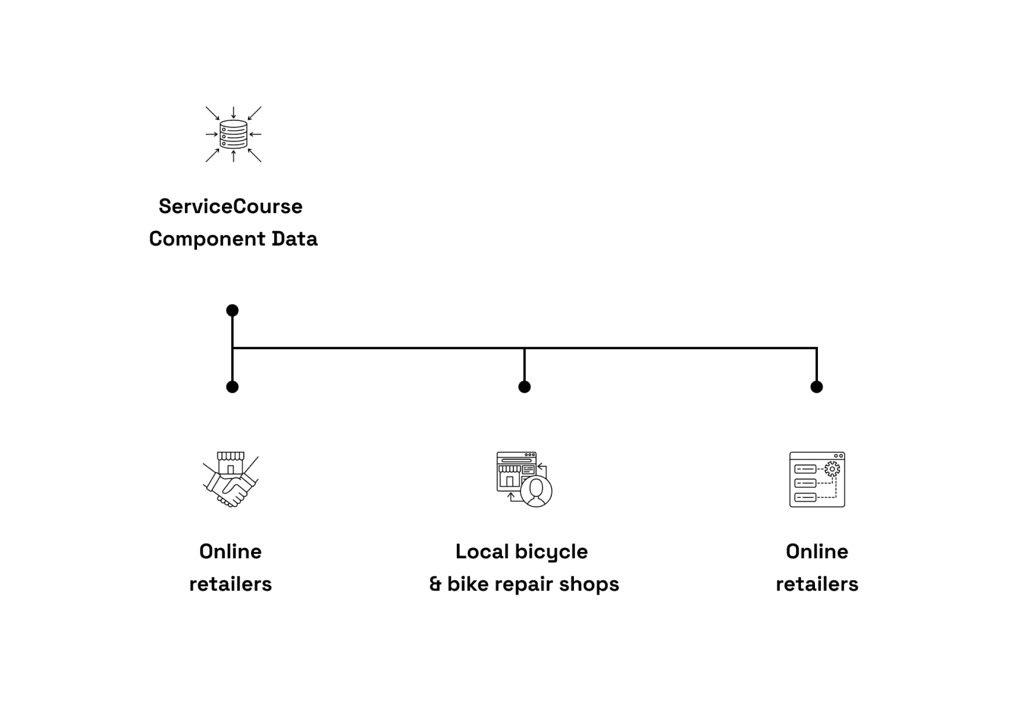
Leveraging aggregate data-driven insights
Although ServiceCourse would initially be designed to function off of recommended manufacturer service-intervals, component-level data collection would allow for real world insights across each component’s performance.
Both performance and value-obsessed cyclists could see which parts last the longest
Retailers would be able to see consumer trends
Manufactures could use the data to analyze performance in real time
Insights created from the data used could pave the way for additional partnerships, empowering business to connect with riders through an additional avenues.
Final thoughts
Although ServiceCourse was created as a concept, by the end of the project (and I) had made some major leaps across usability and visual design through continual skill development and iterations. Curiosity and a motivation for developing my craft throughout first digital design helped shine a light on what more I needed to learn.
Reflecting on the experience, two things stood out:
Seeing the unprompted reactions of delight from users during prototyping that would confirm the design decisions meant to make an app that was helpful, proactive, and delightful
The tremendous growth across design thinking and visual design that was a result of staying curious to understand what could have been executed better


